DG DP RLP 08
Illustration/Motiondesign
This dates way back but I really wanted this in my portfolio for the shear fact that I rarely do any illustrations, but love doing them. The whole print part and typography is not my work and was done by my good friend Schui Baumann. We were approached by descom to design the campaign for the “Designpreis Rheinland-Pfalz” and the “Designgespräche”. The theme of the talks was “a matter of taste” so we went in and made it as tasteless as we could to steer up controversy for the upcoming talks, which actually worked to some degree. We were young, we were students, we made mistakes. But fun it was, a lot actually. We made posters, books, forms and the motion design for the events.
Our Idea brought the relationship between designer and customer into the focus and working with vectors, hideous colors and comic asthetics I created a series of tiny illustrations. I did not want this to be from one perspective only, so I tried to make it work for both sides – clients and designers. We started with the campaign for the talks and transfered the concept to the “Designpreis” part. The latter is serious business and people are receiving awards for great design work. To not let their great work be overshadowed by the crude and funny design of the talks – to make the awards feel substantial and worthy – we broke it down and reduced it to make it work in a more serious and classy environment.
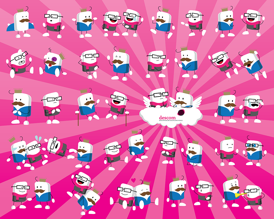
The vignettes are made up of real situations in client designer relationships and depicted in a metaphoric sense.

From the german saying “customer is king” the client got his crown, a mustache for the conservative look and a single hair to make him look a bit naive when it comes to design. The designer on the other hand has the trademark black rim glasses, the scarf – in 2000s hot pink and the enthusiasm. Since we knew we would swarm the posters with them I tried to make the illustrations as simple as possible to keep it at least a little readable.
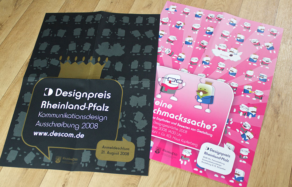
The posters.
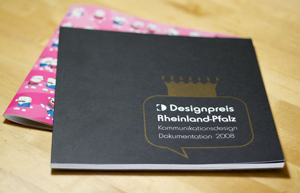
The two books produced.
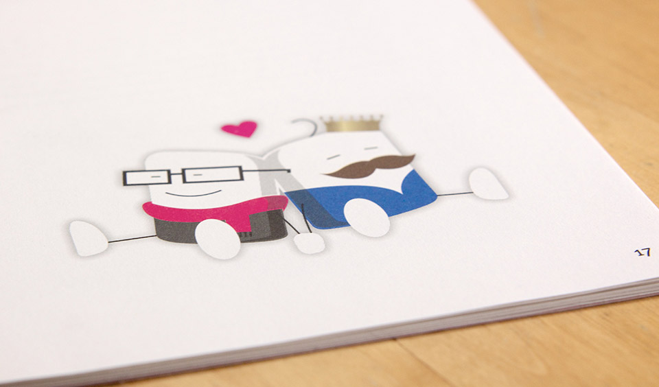
In the book for the talks the illustrations can be seen here and there.
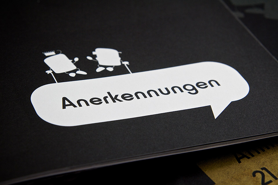
In the book accompanying the awards they are only tiny silhouettes keeping the connection…
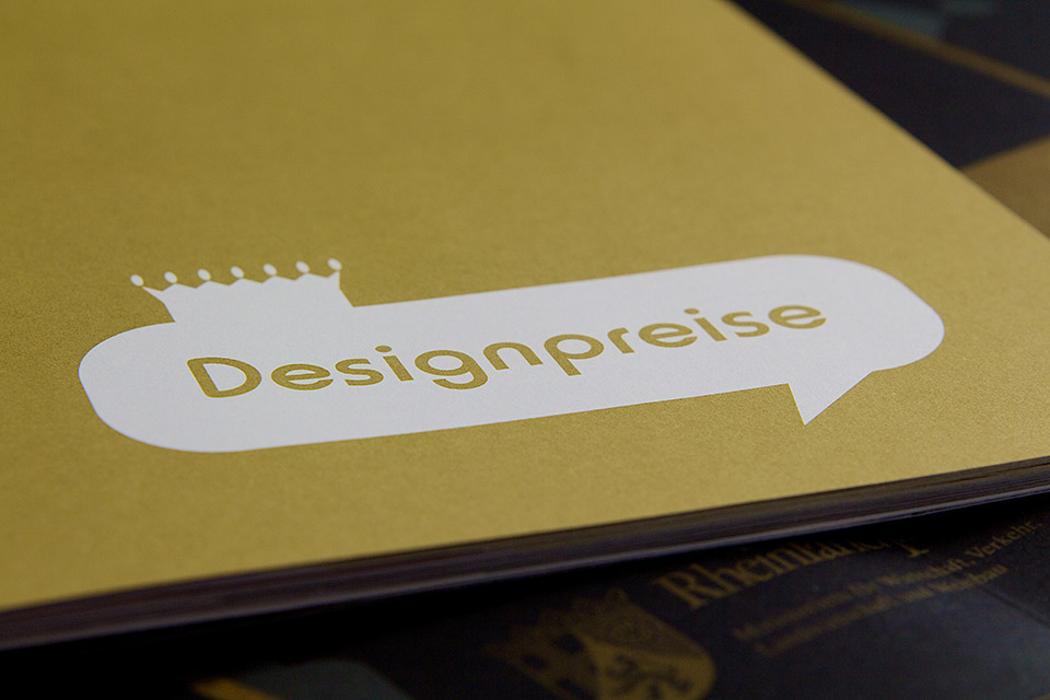
..while just the crown is left for the announcement of the winners.
