WCW M.A.N
Motion Design
This animation was produced and designed for the exquisite Autorenkombinat. M.A.N. had asked them to do a short piece on the study they had conducted and in the end I was in charge of designing and animating the script and concept the guys and gals at Autorenkombinat came up with.
My idea was to center the whole animation around the form of the circle since cities are small circles on the map. The relevant data could easily be shown in diagrams based on circles and a lot of the typical traffic signs come in form of circles too. The challenge was to reduce the design and work with the information.
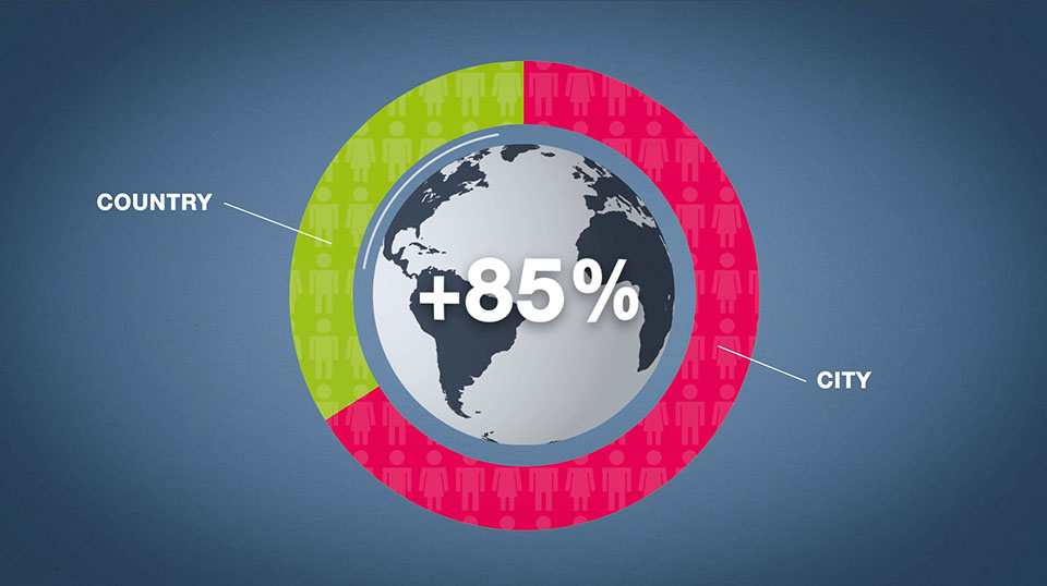
People are moving to the cities.
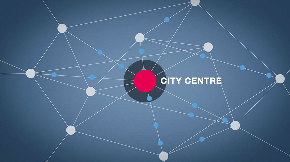
Reducing nearly everything to circles, telling the stories via the animation.
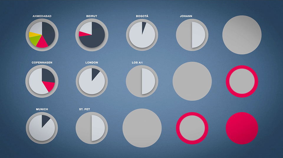
Although detailed statistic data played no big role in this piece, all graph were accurately depicted.
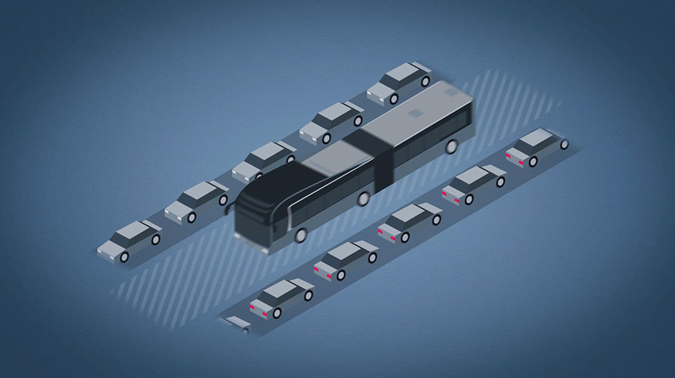
The isometric perspective on the bus and cars make a nice contrast to the otherwise flat design and make the explanation of priority bus lanes pop.

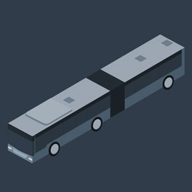
The design of the bust went from generic…
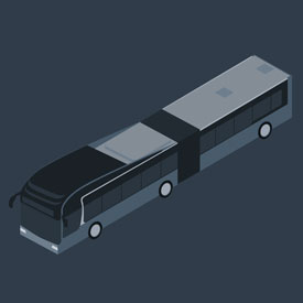
…to specific.
